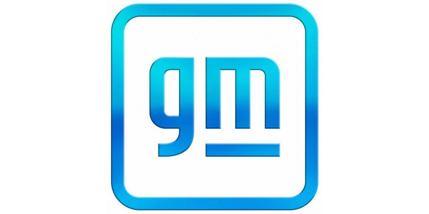
General Motors has unveiled a new corporate logo. The new GM logo incorporates lowercase script with the “m” underlined, surrounded by a square border with rounded edges. The new logo is intended to acknowledge General Motors’ latest focus on electric vehicle technology and vision for a world with zero crashes, zero emissions, and zero congestion.
“As GM amplifies its EV message, it has also created a revitalized brand identity designed for a digital-first environment,” General Motors states in a press release. “The new logo builds on a strong heritage while bringing a more modern and vibrant look to GM’s familiar blue square. The new brand identity extends to technology brands including Ultium. The team of GM designers tasked with creating the new logo considered how to balance the history and trust inherent to the existing design with GM’s vision for the future.”
The new General Motors corporate logo will feature a variety of different colors, including several blue tones, the latter of which is intended to “[evoke] the clean skies of a zero-emissions future and the energy of the Ultium platform.” The underlined “m” is intended to look like an electrical outlet.
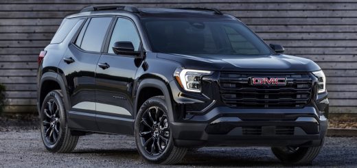
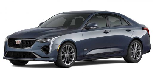
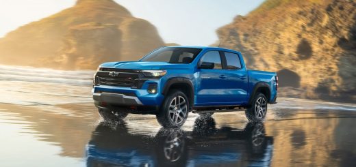
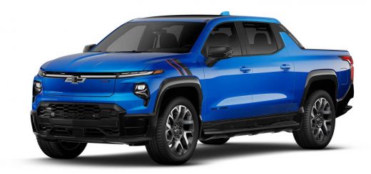
The updated corporate logo will be used in all corporate communications going forward, and coincides with the launch of a new marketing campaign titled “Everybody In,” which will promote The General’s range of all-electric vehicles designed to fit the lifestyle and budget of every new car buyer, including for work, adventure, performance, and family. The range of new EVs will include Cadillac, GMC, Chevrolet, and Buick products.
General Motors has announced it will launch 30 new all-electric vehicles worldwide by the 2025 calendar year, with more than 40 percent of GM’s U.S. portfolio equipped with battery-powered propulsion by the end of 2025.
Subscribe to GM Authority for ongoing General Motors news coverage.





Comments
Meh….
It would be more impressive if the suits at GM would figure out where all the electricity to charge these idiotic things will be coming from. Have they not noticed that not everyone wants to park for 12 hours or more waiting for a full charge?
So moronic… but hey, guess that fits our changing society now. It DOESN’T HAVE TO MAKE SENSE! JUST DO IT!!!
Well that fixes everything……
RIP to the Mark of Excellence logo 1964-2021
Yeah, this new logo doesn’t do much for me. Not terrible (see Stellantis), but not that good, either.
But to be fair, the Mark of Excellence died in what was it, 2009? Yeah, it stayed on as the GM logo, but it hasn’t “marked” anything for over a decade.
Did they bother taking a survey on likeness? If so who were the surveyors? It’s ugly and unbecoming for a number one corporation of vehicles made in the United States of American! I’m aware they are made in other parts of the world…..but this logo looks childish! Not a fan of this new logo. Could of taken that money and lowered tge price of your vehicles so that the average American could once again afford them. I don’t know how other poorer countries afford these cars…do you?
Don’t worry. GM produces more affordable, not to say, cheaper cars in those other poorer countries.
Looks like something you’d expect to see designating a handicapped accessible toilet.
Lower case letters=weak
The accuracy of that statement though hahaha
The best description of the new logo I’ve heard thusfar is an elephant looking over a cliff lol…wonder what significance that has
So this new logo is supposed to reflect GM’s EV Technology?, my first thought before reading the article was that this was going to be a strictly new APP Design.
I love elephants. They are one of my favorite animals.
An I agree with G8Burnout’s preference.
But to be authentic, the “g” would have to be mirrored, since the trunk of an elephant is rather in front, and bowed backwards, to the mouth.
An elephant standing on a platfor (or a crushed mark of excellence).
I hate it.
This is where I get kind of frustrated with GM. The never ending changing things for what? They can’t stick with names. They can’t stick with logo’s. They can’t stick with a theme, tag line, etc, etc. I’ve said it before and will state it again. You don’t see other successful brands doing this.
How much did they spend ($$) coming up with this brain-dead logo now? Such waste. Find a plan, stick with the plan, get good names and keep them and stop changing direction every time the f-ing wind changes.
Kia and VW changed their logo, too.
Several Successful Brands changed their logo in the past year. This isn’t just a GM thing.
I understand that other brands do change things. Just not as much or as often as it seems GM does. Normally when others do, it’s a minor tweak. GM seems to jump ship from one theme to another way too much. And I’m not talking about a jingle or advertising message. I’m talking about logo’s, brand themes, emblems, etc. GM’s messaging is always too mixed for people to follow and know.
GM has only changed their logo 5 times in it’s 115 year existence.
Nebula: Forget it. You are totally not reading what I wrote. Seems like you are just looking for an argument.
Could say the same to you.
I’m totally on your side on this one, Berning regardless of past disagreements. You speak the truth 100%. This is just change for the sake of change and there’s no benefit to it. Another root viciously and needlessly severed at the base of GMs once proud and mighty now slowly dying tree. The people running GM are lost. Accordingly, GM is lost.
Yes Idiot Boy. That hits the nail on the head totally. There are times when change is needed. Yet change is not needed every three or four years. And as I was speaking about that someone else isn’t getting (Nebula), is that GM tends to change a lot of things for zero reason. I’m referring to car names. Brand logos. Emblems. Tag lines. Jingles and/or advertising themes, and so on. What’s more, absolutely nobody will “get the meaning” of this “new” logo. It’s stupid and was a complete waste of money that should have been used to enhance the vehicles and interiors to better place GM in the market place. Personally I don’t feel GM’s interiors are terrible, but when you look at the interior pics of the new Jeep GC and GC L, there isn’t much in the GM line that will compete. Same for the all new Grand Wagoneer and the entire Lincoln line. While GM is messing with this all new logo, Jeep and Lincoln are becoming world class. Anyhow……
Branding and advertisements change frequently in every industry. You are hyper focused on GM but if you look at other companies they change just as often.
Read my posts. You are hyper focused on one part of what I stated. I’m not interested in getting into some drawn out argument on this. I have been and keep referring to (yes) the logo, brand emblems, model names, advertising branding and several more. But if you are only interested in zeroing in on this one thing: The GM logo by itself, then you are totally correct. I was totally wrong. Now may the world move on.
Amen, Dan
5 times including this one?
Or before this one.
Including this one
And 3 of this changes were just minor colour changes. So really, they have only had 3 logos in 115 years.
Mass-market cars advertise themselves when people see them on the streets. This is why vehicle styling and changes are so important.
The point of ads are to convey financial information, i.e. cost and financing. Just see how many car ads consist of a picture of the car (which shows traits by itself like sporty or rugged), and cost information. Jingles and advertising messages are far less important than you make them out to be.
Count me OUT if GM does not offer me vehicles that I do not want to buy.
Come on people it’s a logo that will show up in the manual somewhere. You buy Chevrolet, GMC, Buick and Cadillac which just happens to be made by a company called gm.
Its not that significant in the scheme of things, but they felt the need to change it and change it to something worse.
They’ve been downplaying the traditional “GM” mark logo since the bankruptcy, they even removed it from all their dealer signs too.
They tried this before once for a few years in the 90’s too, they downplayed the GM mark and just started using “GENERAL MOTORS” spelled out in ads for a few years from 1994-1997 or so…..and then they changed back again.
I showed it to my wife and she said it looks modern. Capital bold letters looks old just like Ford’s script font. It would be interesting to know the age of the people that don’t like the change. My wife and I are in our 40’s.
I’m 38, it’s atrocious and undignified!
Doesn’t really matter. GM will go down the drain as will the rest of the auto industry who have so cleverly married the idea of Nothing But EVs For The Forseeable Future.
We don’t have the power. We don’t have the infrastructure. The cost for all of this insanity makes it all the worst possible thing we could be doing, yet they’re off to the races!!! And down the drain they will go.
I dont like it, should only be reserved for electric vehicles.
Could be worse. Rumor had it that they wanted to not only change the logo, but the NAME. And they still might eventually.
“General Mobility.” Just awful.
Are there any cars branded “GM”?
I only know of Buick, Cadillac, Chevrolet and GMC, plus Wuling and some others in China.
I don’t know of any car being branded “GM”. Do you?
This is not different from the upcoming new automobile corporation named Stellantis, whose company name or logo you will never see on any car of their 14 brands.
GM was used once for a Vehicle. The GM EV1.
GM = General Motors
GMC = General Motors Company
No difference to me.
GMC ≠ General Motors Company.
GMC originally stood for Grabowski Motor Vehicle.
Do your homework.
I thought GMC was Gay Man’s Chevy.
So generic. I give it 3 years and it will be gone.
Just like the ELR, the CT6, 1.6L TD, Blackwing…..
That is hideous. GM was once the world leader in car production; this is an apology for a company. “Ooh, ooh; we’re sorry for everything we’ve ever done wrong. Don’t shout at us! We’ll just sit here in the background and be quiet.” That, in every sense of the word, is pathetic. 🙁
Once upon a time … but times change. Listen to Bob Dylan who sung in 1989
(just the last verse of the song:)
The line it is drawn, the curse it is cast
The slowest now will later be fast
As the present now will later be past
The order is rapidly fadin’
And the first one now will later be last
‘Cause the times, they are a-changin
I don’t think the ad is inclusive enough? What about surfers with no arms? or no legs? What about trans gendered cat people? What about hemophiliacs that identify and gender binary firetrucks? What about the blind? You should design cars with them in mind too, what about the dead? The dead aren’t important to you? Bigots……
By not including these categories GM or sorry…..gm, you’re basically noxies, literally.
👍👍👍👍👍
I get aiming at a diverse audience considering some demos, LBGT for example, have high surplus income, as do single women. Minority shoppers have favored imports for a long time. Ford, too, is doing the same thing.
Any company wants to make every demo feel noticed so they can grab their money. The Germans have been good at this while GM has been mainly a truck company aimed at that demo.
Are you so insecure that seeing a 1 armed girl or a black person in an ad threatens you? I am glad GM does not listen to the people in these comments, or they would be fading into irrelevance trying to sell muscle cars to midlife crisis guys with potbellies and comb-overs.
Xiaomi called. They want their “m” back
Ok, how is this “hip” modern styles in general suck. An older co-worker (he’s a gen xer) and I were discussing GM’s turbine semis of the 60’s and just how in general, styles of the late 60’s and early 70’s where solo much better. Rolls hasn’t changed their logo and it’s still georgeous. Honestly, the font on pre-64 gm looks better
Actually Rolls did change it but just slightly after the Rolls-Bentley break up.
Not only that, Rolls Royce cars overhauled the logo this past August, dropping the frame and words.
WTF is this?
It’s the g. It looks strange.
Is it April 1st?
GM paid 10 million for marketing study, 10 million for focus group, 20 million for ad agency, 15 million to pay a company to come up with the font – and …. you get something that would get 10th place in a grade school competition. Typical GM.
Don’t forget the meetings…..and meetings about the meetings and meetings to plan more meetings about the meetings…….
Don’t like it…
Really, you guys judging products because of a logo change?. GM did go BK with “Mark Of Excellence ” ya know….
gm, we a tech company now 😉
You think they bought it?
Tesla passes $150 Gagillion Dollars……..
Meanwhile at the Ren Cen
“LoOk aT OuR NeW LogO Durhehdurrrrrr”
Tesla is a bubble waiting to pop, making a lot of the true believers broke because they drunk the Kool-Aid and dumped their savings into it. They are worth more on paper than every other car company put together with less than 1 half of 1 percent of the market and non-existant profits. That can’t last.
Facebook, twitter, instagram, gm
Yes, everyone wants to be a douchebag….
Tesla survives as a cult, with its own ecosystem of charging stations and a the proprietary routing app to find those, and probably only those. Compare it to Apple. You can’t install apps on an Apple phone except from the Apple store.
The decision to axe the established GM logo is just pathetic and sad. They’re so out of touch with their own proud heritage (which they should honor and be rebuilding upon) that they just symbolically threw it all away in a final damning sacrifice at the Altar of Wokeness.
Grow up and realize change happens. The logo is still a simple GM and blue just refreshed. Look at Burger King as another example. They just redid their logo earlier in the week.
I’m not going to cry over the change of a logo.
My Whole family has been working with GM since the 50s Nothing is going to change.
The one they replaced was from 1964, this is the one they had 38-64:
https:// static. wikia .nocookie .net /logopedia/images/4/47/GM.jpg/revision/latest/scale-to-width-down/200?cb=20120825090422
This has nothing to do with growing up. Nor is anyone crying. It’s just stupid, dude. That’s all.
It improves nothing, is a major unnecessary expenditure at a time when every dollar should be directed towards improving the actual vehicles (I won’t say cars because GM’s barely a carmaker anymore) and dilutes the strength of a revered mark. If anything, it’s further proof of the ongoing identity crisis at GM.
Ford isn’t going to ashcan the time tested Blue Oval with its old-timey cursive font in favor of some touchy-feely Big Tech style effeminate swooshy all lowercase fonts – that’d be dumb. So why is GM so unsure of itself?
Hopefully, no automaker decides to further the trend and hire an autistic kid to style their logo like the kinder, gentler, inoffensive and oh so dorky “thumbs-up” trying hard to mask how truly dangerous the self-appointed Gatekeepers of our freedom of speech at Facepalm really are. All this talk about new logos, how about a new slogan? “Proud to be Facebook – the Company Bringing 1984 to Life!”
The reasoning behind the new GM logo is simply beyond flawed and the actual product of their misguided effort – the lame new logo – SUCKS. That’s it. Finito, dear Logical One!
Yes and Ford is doing so well right now. Partnering to use VW’s EV platform in Europe. Investing in Rivian and GM outing Ford in trucks in 2020. Maybe Ford shouldn’t be the example of good decision making.
Yep, I will be driving a handicapped toilet soon. Geez.
One with all soft corners trying to embrace you and be touchy feely. As limp as GM management
Something Ford doesn’t have the “vision” to do…
Ford’s logo is a perfect example of what happens you put off modernizing it. Ford realized 60 years ago that it’s too difficult to put the logo in any cast or molded parts or even print it on small labels, which is why the whole car says FoMoCo.
Ford’s logo is pretty damn cool though.
Kind of like the exact opposite of this.
At least the form of it, the horizontal oval, makes it easily identfyable, even under bad light conditions.
Only for car geeks. Subaru’s blue oval looks almost the same. Other oval logos include old Kia, Scion, Land Rover, Toyota, Infiniti, Lada, Hyundai.
Squared off corners are threateningly aggressive and toxically masculine! Can I say masculine? Is it okay for me to say that?
Uppercase letters are equivalent to shouting!
Our old logo is offensive, people (and bears and unicorns)!
Can the Committee look into whether or not the color blue might potentially hurt someone’s feelings? Perhaps we make it a more inclusive shade of blue, then? How do we get around that white background, though? Isn’t that background sort of racist?…
very reminiscent of a 1970 Australian Holden kingwood key.
That may just be the only thing it has going for it
What’s next, getting rid of Chevy Bowtie? Rearranging deck chairs? Good work. Get rid of recognized symbol for this? Lower case letters for lesser quality? gm Authority now.
Is this an early April Fools joke? New design looks like Sh$t?
»The underlined “m” is intended to look like an electrical outlet.«
This needed an explanation for me. In my world, electrical outlets are for plugs with round pins. It took me some time to grasp that GM is s US company, and that in USA they have these NEMA plugs with flat pins. In China, they also use such plugs, but not exclusively.
So, for GM being present no longer world wide, but restricted to countries using NEMA plugs and outlets, this is OK.
Electrical outlets are so… passionate. Jeebus, any wonder how we got here?
The article is inaccurate, so your statement is wrong. The official GM press release says “And within the negative space of the “m” is a nod to the shape of an electrical plug.”
That is, the white space looks like a plug from the top. It has nothing to do with NEMA outlets and Chinese prongs or whatever you’re dreaming up.
NEMA is the Standard that Plugs in the US use. Observer7 is correct. They are talking about the standard 2 flat pin plug that is seen in the negative space here. Specifically if you want to look it up “NEMA 1-15P.”
No, read his comment carefully, particularly the very first sentence.
The article and him are interpreting the white space in the m as two vertical socket slots. That’s wrong. The official GM line is the white space is prongs/pins looking from the top.
A Europlug consists of two cylindrical pins, and therefore looks like two rectangular vertical bars from the top.
Round pins would look like rectancular vertical bars when looking FROM THE SIDE. From the top, just as two circles.
The entire logo is negative space, not just the “whitespace” where geeks and daydreamers embark on fantastical quests for deeper meaning, rather in the failure sense that everyone else who isn’t in outer space can plainly see as another [gm] total misstep; not an improvement.
Look at this image wikitravel dot org/en/File:Plugs.png
It shows various plugs or outlets looking from the bottom or top.
In the lower right corner, USA (Type A) and (Type B) are NEMA plugs. NEMA meaning the US National Electrical Manufacturers Association. In most European countries, the one marked as “Germany (Type F)” is being used.
See also “Mains electricity by country” on en dot wikipedia dot org (replace ” dot ” by a dot).
So, when the vertical spaces in the lower case “m” are meant to symbolize an electrical plug, this applies only to NEMA plugs, and the countries where these are being used, which is North America and Caribbean (I found such plugs also in Cuba).
I just hope they don’t start putting it on their vehicles again. I’ve never been a fan of that regardless of what the logo looks like.
SHITE CARS FROM A SHITE COMPANY. A changed logo wont get them out of tbe sh$t. Wasn’t so long ago they were pushing for loosening of regulatory rules on fossil fuels.
The troll has entered the chat.
Make a poll on the new logo! Lets vote this out! Stick with the old logo and keep that chinese kanji bs off my truck! I have choice words for anyone who is redesigning GM! Lets start with your business model of building lame vehicles that dont sell! Remember in 2019 when the offers of 20% off couldnt get people in the door? Lets redesign the “we wont negotiate” policy at
Haha, I like you a lot! 👍
Don’t worry big man, the logo won’t be on your truck. Hasn’t been for a decade, looks like you never noticed anyway.
ALL GM is good for. Symbolic gestures that count for nothing! All while GM continues to wither…
Turn to left 90 deg. Now is a Chinese logo :V
HORRIBLE. PLEASE DO NOT DO THAT.
Sorry, but I don’t like it at all. It tells you nothing about the company that it represents. It has no meaning. No memory. No class. I hope it doesn’t last long. Glad they aren’t putting in on vehicles. I wouldn’t want it on mine! It looks like a kindergarten class designed it.
low case means small and compared to decades ago, gm is small.
WEAK!!!!!!!
people working from home and not driving their cars to work will do more for pollution than all these EVs because other than nuke power anything else that produces electricity to charge them pollutes. GM is trying to get their stock up by being know as a tech company like tesla and not as a old fashion car company. tesla sold 500,000 cars but gm and ford sold 1.4 million pickups alone. half the country lives in a area where it get down to freezing and the EVs lose 25 to 40 percent of their range in cold weather. you get in your EV in a heated garage and the dash says you have 50 miles of range and you are only going 30 so you feel OK. one you start down the road it drops to 30 miles what do you do keep going hoping to make it are turn around and go back home ??.how many people are going to stand out in the cold while it take hours to charge back up ?? that is why i say install a home charger in the price of the car and maybe more people will buy since they can charge overnight in the garage and they will have a full tank. #1 son used to drive 90 round trip to work and now his car sets in the driveway 5-6 days a week so he is doing more to reduce pollution than a person charging up to drive those same miles
No problem with the new logo. In a few short years General Motors will be bought out by a Chinese or Russian Company and the logo will again be changed.
Remember, the new logo will be on an electric CAMARO that still has visibility problems. It’s name will be changed to “C” so we don’t offend anyone.
At this point…………..who really cares…………most people just bumble along.
All Buicks are still made in Detroit with a FISHER BODY…………..aren’t they?????
Doesn’t GM already sell more cars in China than in North America?
Isn’t China the largest market for practically all automobile manufacturers worldwide? If not, that manufacturer has a problem.
BTW, the largest shareholder of Daimler, the maker of Mercedes, is the owner of GEELY, one of the larger privately owned automobile manufacturers in China. Geely acquired Lotus, and a 49.9% share of the Malaisian automobile manufacturer Proton, as well as Volvo passenger car company, and has a stake in Volvo Trucks. Daimler sold the “Smart” factory in Hambach, France (some kilometers south of Sarreguemines [Saargemünd in German], i.e. not far from Saarbrücken) to to chemical company Ineos (owner: Jim Ratcliffe), which will build their Grenadier as a replica of the historic Land Rover Defender. The Smart will be continued as a common product with Geely. Mercedes is also to develop a new 4-cylinder petrol engine together with Geely.
Is GM already that closely linked with their Chinese partner SAIC?
Not a fan, much prefer the existing one! My all time favorite the 1938 to 1964 one.
You can put this with the torque badging. It looks stupid and meaningless. The current logo has an imperative image about itself. The new logo looks amateurish and lacks the a leadership ambiance
Displacement numbers are meaningless in Electric Vehicles as there is no Engine. Torque badging makes much more sense, they just got a head start on it.
You can put this with the torque badging. It looks stupid and amateurish. The current GM logo is a bold imperative image while this new logo lacks a leadership ambiance
Somebody smoked too much grass at the “designer and artist” party that night. I love how these potheads know that the logo “evokes clean skies and zero emissions…” Where can I get a job like this!
What a fools errand this is.
Maybe Ford will now have to change their 100+ year logo. Or Mercedes-Benz will add some points to their Star. LOL
You don’t buy the car because of the Logo. BUT a logo denotes Instant Recognition, Strength, and Staying Power of the maker. The new on does none of this!
The “gm” logo wont be on any car, just as the previous “GM” logo. Brand logos are on the cars.
Look at the decals on the glass on the cars.
It will be used on parts for identification.
@Nebula: yes, common parts may be marked “gm”.
But even engines, even if common to all brands, are branded “Buick”, “Chevrolet” or “Cadillac”.
WOW that change will make me buy GM. HAHA
further proof Mary Barra must go..I sold all my GM shares.
Now that we’ve gotten rid of Trump and his henchmen, let’s do the same for Barra.
Lower case letters show weakness, not strength! Barra will run this company in the ground. EV’s only??? I would NEVER buy one! But, then again, who asked me?” New logo is a LOSER!!!
It’s only a matter of time before you will not be able to buy an ICE vehicle. gm isn’t going to let VW and Tesla take over the market. The only place a normal buyer sees the gm logo is on their manual. I think we’re making a big deal over nothing.
What are you talking about? It’s on their HQ Bldg. in thirty foot square letters AND every P.R. and adv piece, as well as parts packaging ——- it’s EVERYWHERE. It’s the “corporate identifier”. It’s the “corporate symbol” AND it’s poorly done. DUMB. AND it remains to be seen when ICE vehicles go away. It will be a LONG TIME yet and then a robust used car market ——- unless the new dolts in Washington ban them.
If we could survive the last four years under Fur Trump, we can survive a logo change and embrace good government.
👎👎👎👎👎👎👎👎👎👎🤮
Because all 310+ million people in the US drive past their HQ building(s)? Last time I checked I see commercials for Cadillac, Chevrolet, Buick and GMC.
If Tesla can make an ugly electric truck, then GM can make an ugly logo to match them.
It’s a very weak design. Lower case logos turn me off.
Why didn’t they go with three circles for zero, zero, zero! I thought this was a joke at first (maybe just to be used on the electric cars. This is just as bad as getting rid of the wreath around the Cadillac emblem.
Joe in T.O.
comic sans version on twitter (@mcmike) is much better
At least Now I know where the 2017 Holden marketing team went.
To Detroit to design the new GM logo 😰
About as strong and crisp as wilted lettuce.
It’s just a logo! The mentality of the bashers definitely shows what their logo would look like ! “PATHETIC”
HI Good
Bring back the red bowtie on performance chevy vehicles…
Bring back Goodwrench
Bring back GM Performance Parts
rotate logo counter clockwise , reads elon 🙂
How exactly does this ‘new’ logo relate to Electric Vehicles?
What exactly is the underline supposed to represent?
It’s lower case— and that is supposed to be woke somehow?
I think GM might better put a Chinese Character in a circle to
satisfy their largest market!
how many people here think big oil is just going to roll over for the EV craze ?? they have too much invested and i see $1 a gallon gas coming
motorman, i think your right. I know corporate PB and Exxon have invested heavily into battieries, but US Fracking companies run the oil show and have no intention of leaving. Anyone remember when they whipped the Saudis in 2015? back when gas was 1.50 a gallon with taxes???
also road taxes and power grid. the “EV advantage” is that you dont pay gas prices, most of which are road taxes these days. many states are switching to higher EV registration Fees to offset the lost road taxes. further the electric grid will need to match the energy or exceed that of the gas saved. Sure tesla claims 108 MPGe, but MPGe is only starts its measurement after the battery is fully charged. Now consider that batteries are 90% efficient, 90% transmission line losses comming from a gas generation station that is 60% at max efficiency, your 108MPGe tesla is only making 50MPG, or your standard prius or camary hybrid. Same with the New Hummer EV, its supposed to make 48MPGe, which is about 22mpg actual. when this massive new requirement for energy hits a grid that is not prepared for it, rolling blackouts wide and vast. and the need for massive increases in eletric costs to overhaul the eletric grid.
As America sinks into the Abyss so does GM. This looks so 2020 hip and wimpy and weak and is a change nobody asked for!
Sad and pathetic just like our country has become!
|
There was talk about if “GM” was ever on a product being sold, I found one, on the “Frigidaire” refrigerator:
On Wikimedia Commons:
commons.wikimedia dot org slash wiki/File:Rolli_Days_%2833950807555%29 dot jpg
replace the ” dot ” by “.” and the ” slash ” by “/”