Since the inception of the Buick brand, the Buick logo has undergone quite the transformation, going from a simple text-based insignia to a single shield derived from the Buick family’s ancestral arms, and from the first iteration of the Tri-Shield to an eagle named Happy, and then back to the modern Tri-Shield we have today.

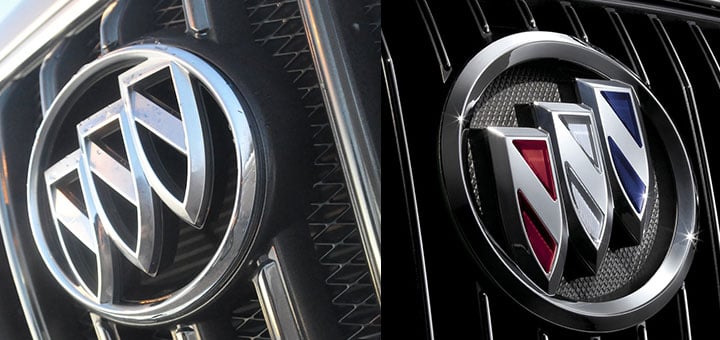
Red, white and blue Tri-Shield on 2015 Buick Park Avenue (Chinese market)

Monochromatic Tri-Shield on 2013 Buick Enclave (North American market)

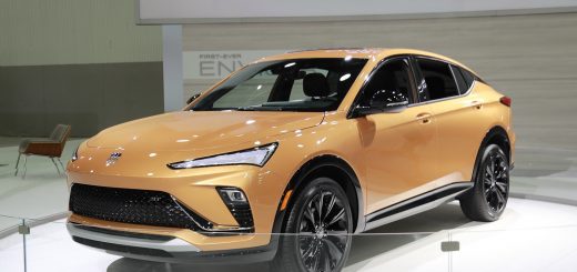
2017 Buick LaCrosse front fascia with color Tri-Shield
Today, there are two different versions of the Buick Tri-Shield logo — the variant with chrome shields used on Buick vehicles in North America, and the version that fills in the three shields in red, white, and blue on Buick in China. But that’s about to change.
As previously announced by Buick and seen in recent teaser videos, not only will the all-new, 2017 Buick LaCrosse unveil Buick’s new corporate face, but it will also replace the monochrome Tri-Shield with one that has the three shields in red, white, and blue, thereby synchronizing the logo across Buick’s two global markets of North America and China. And this brings us to our question: which do you like more — the monochrome Buick Tri-Shield, or colored version?
Vote in the poll below and sound off your opinion in the comments.




Comments
Red white and blue all the way.
I’ll second that sentiment.
Red, white and blue looks kind of odd on the mocha metallic models – doesn’t seem to adversely affect the other exterior colors.
And mocha has (fortunately) become less popular and less available. Monochrome looks more confident and premium to me, but to each their own …
The colored shield was used before on all sorts of colors and never said to look out of place or odd. So why all the sudden now and you?
Bring back the Hawk!
Monochrome, but must admit that the overall effect (dollar grin inspired grill, positioning of tri shield) looks premium.
I just happen to like the understated post modern monochrome and how it signaled change at Buick.
“post modern monochrome and how it signaled change at Buick.”
…except that the monochrome look began in 2004, right in the thick of the “old Buick” era. Initially, it was done as a cost-cutting measure to simplify the production of parts for some models. Not exactly the sort of change GM wants the brand remembered for.
Also, I suspect GM may be bringing back the red, white, and blue in an effort to anchor Buick as an “American” brand in the face of possibly importing vehicles built in China. If they think that will make people forget or ignore where they’re built, I say they are mistaken.
It was NOT revised to monochrome to save any money. It was done because virtually every premium brand that Buick was going to compete against had a non colored emblem and Buick felt that it was the start to a NON stodgy brand image.
Remember that while the Buick Marketing team wanted to go upscale we had to work toward that slowly because while marketing can change overnight the product takes time. While the first LaCrosse was built on the old W body and was not the most forward thinking the interior was very premium and the whole vehicle had great quality. In 2005 the Enclave was being developed which was very premium and the rest of the line up followed.
My 1995 Buick Regal has he tri-color shield on the grille. And it made this vehicle unique!!
Yeah, that’s my point: 1995 Buick is something many of us want to forget.
I was 19 in 1995 & remember the brand as worse than even Olds.
The monochrome helped me to rediscover and notice the brand.
I also think it reads low key like Audi and Benz.
Tri-Color shield all the way. As I notice the newer Buicks on the road, I find the emblem so dull without the color. There has been a Buick somewhere in my family since 1954 and the tri-color logo was always my favorite.
The Red-White-Blue in the tri-shield logo is part of Buick history.. as there are some things you’ve got to keep.
One of the first things I noticed on the Aviner concept was the color tri shield. This looks so much nicer then the current logo. Plus it brings back a bit of history for the brand which used that version since the 70s.
tri shield colors make cars unique ahhaaa. i think no colored is more quality. and it must super detailing finally. i hope the car is better fuck that colored logo or not
The non color was brought in in the era of Lexus and Acura using billet looking emblems to represent quality and precision.
The color was of an earlier era where many emblems were plastic and near the end broken and faded. I know as I had to replace a few in the family. The change was not due to cost.
As for is this a good thing. I do not expect it will hurt a thing if they change it but will it sell more cars I would expect not either way. Few people buy cars just for the emblem.
Just make sure if you do go to a color make it damage proof and fade proof as a poor emblem representing a company is a poor reflection of their quality.
For example. The Chevy bow ties for a long time would go to hell and look crappy on some trucks, cars and the HHR. Even if the car is in good condition that large faded and pealing bow tie made the car look poorly and really made it look low quality as it was out front of the model or right there at the traffic light in front of you.
Our company had plate frames that represented our company. They went to hell and we had to change suppliers as it really reflected poorly on our company.
So what ever they chose just make sure it holds up and that is what really matters.
I agree; I loved the electrified Rivera Concept tri shield logo because it matched the car paint job, but can only imagine how bad they would look after a few years.
Simple if often best as it is easier to maintain. I agree that the logo will not be a make our break issue for the brand, and that the grill is far more important in terms of design language.
One thing we all must expect is the emblem on the grill must keep a similar shape to share with Holden and Opel.
With these cars growing closer I expect GM will make their emblems more interchangeable.
You can fill in the color from there.
I think the colored tri-shield looks better escpecially with Buicks newly designed grill .
Wow, a lot of replies so I may be repeating someone’s response, but I say use the color badge for standard or luxury models and use the monochrome emblem for ‘type R’ or other special editions.
Maybe it is like the open bow tie on the Z/28 and lets more air in. LOL!.
Just kidding.
Normally I’d consider this a regressive move. Everyone knows Buick is an American brand. And some realize it’s kinda so ‘Opel’ and China that pretending it’s becoming ‘more’ American is… sad?
But why I think this is a wise move is that Barra wants Buick (and GM) to dominate again. And so she’s reminding America that America itself may no longer be an embarrassing car connotation — at least at GM.
And that America’s recovery is something to take pride in.
Keep the color! It’s pretty simple!
This nonsense of colors and designs is pure bunk . It only means something to enthusiasts here . Ford has a small blue oval and doesn’t stand out , has remained the same for years . It kind of reminds me of the BMW circle . These companies have distinctive vehicles and reputations , this is the important stuff . Nobody , in my opinion does more hit and miss vehicle models on the planet than GM . Cadillac’s discontinued models litter the landscape and they still wonder why they have poor brand awareness !! The colors on the shields….what an abysmal topic for discussion !
I like the red, white, and blue tri-shield (very patriotic). I would like to replace my 2017 Enclave monochrome emblems with the tri-color, is this possible and is this easy to do?